“Mobile learning allows for flexibility by eliminating the need for learning to happen at a particular time and place. Mobile learning takes learning flexibility to another level by making instructional content like videos, podcasts, and other multimedia formats available on smartphones and devices. “
Source: eLearning Industry, https://elearningindustry.com/key-benefits-of-mobile-learning,
By Suresh Kumar DN, August 28, 2018
This suggests that smartphones are the best devices for learning. But is this true? In our project we analyse all common devices. We started to develop typical “learning bricks”, small applications that support active learning (By the way: all learning formats mentioned above are passive learning tools and do not support best sustainable learning).
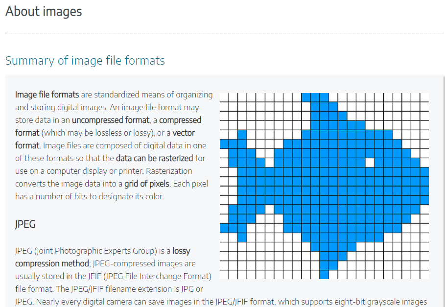
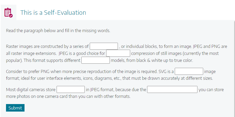
The first learning brick was a small application presenting knowledge about image formats followed by a self-evaluation (using a cloze test). We do not want to talk about problems of cloze tests but about the use on various devices.
The “learning brick” (an example for testing)
We have two screen shots of the application to give you an impression of the learning brick.


In our survey we had a sample n = 81 from seven European countries: Italy, Greece, Portugal, Spain, Austria, Sweden, Denmark. The distribution of devices is shown in the next table. Interesting was the fact that only from 3 user groups feedback was given dealing with the screen: Smartphones (7), notebooks (2), and personal computers (2).
| Personal Computer | 28 |
| Notebook | 14 |
| Chromebook | 2 |
| Tablet | 8 |
| Smartphone | 29 |
Here are the answers and a short analysis.
Smartphone comments
- The application is not suitable and is not intended to use with a smart phone.
- Couldn’t see clearly in general glance, had to zoom in and scroll.
- The title “About images” was duplicated and also the second title “Summary of image file formats” was too big and didn’t fit my screen. Also, some of the text in the box below was not equally sized and the space between the rolls was different.
- Words are too small, it’s impossible to read.
- The presentation is too small!
- It’s to small – you hardly can read the text.
Besides the screen size, other comments focused on the usability:
- For applications like this the screen of a standard smartphone is too small.
- Besides this, entering text without a physical keyboard is unsatisfying.
- You cannot work specifically on the smartphone.
- Using the smartphone to evaluate the contents of a text where it could be useful to select words is not very comfortable (translation, original text in Italian).
These feedback statements might be interpreted that in any cases where an interaction of the user with the content is connected to write a text are problematic.
Conclusion: In the way a smartphone can be an excellent device to watch an instructional video the insertion of text in an interactive tool makes it a bad tool. Text and smartphone – specifically in context with the small screen size, do not seem to get along!
Views: 651
